[WHERE I STAND] Eyecons, widgets, and iOS14
Dear Apple. Thank you for giving me creative freedom, but maybe next time don’t, because I can’t handle liberation.
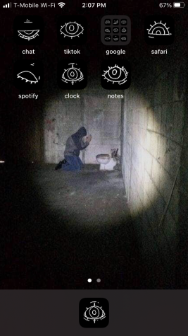
There’s a man praying to a toilet on my phone background right now, and I think that’s the only thing I’ve got going for me. My lock screen is actually acceptably decent since it has taken full advantage of all the capabilities Apple offers a lock screen. When you hold your finger down on my unopened phone, the lone dishwasher on the screen starts flaming, shaking, and sparking, like a kid sucking their seventh bomb pop on the fourth of July, and that’s the type of content I desire my phone to posses. But my home screen… imagine I’m shaking my head… it’s unfortunate.

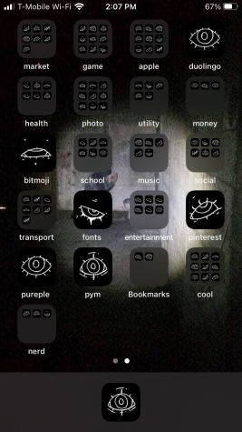
I installed iOS 14 with much excitement after hearing and seeing all these cool customization online and thinking, “I’m an eccentric artist-type. This will be perfect.” Unfortunately it has not turned out so. In iOS 14 we, iPhone users, now have the ability to store our apps off the home screen, along with the ability to place widgets. This has sparked people to create visual masterpieces, from making it look like a grunge notebook to covering every square inch of that bad boy with pictures of John Fitzgerald Kennedy. My plan was to replace the icons of all my apps with line art drawings of eyes and keep my guy worshiping the porcelain thrown in the background, so that all together I would have created an eldritch horror situation with some fun potty shenanigans.
Starting off it was easy. I drew a few eyes in photoshop, exported them to my camera roll, felt very cool and artistic. Then it was time to start making those shortcuts that would replace the app icons. Let me say at this moment, freak shortcuts. I knew that it was going to take a while to turn all my apps into shortcuts, especially since I’m always approaching the legal limit of how many apps can be on one phone, but I also knew that I have a strong work ethic. Along with a strong work ethic I also get monotonous joy out of simple repetitive tasks, so that helped too. After the first twenty I was tired of it. I have 161 apps. Luckily the mini hits of dopamine I get from finishing each one got me through to the end relatively unharmed, and ready to then move all my apps into the new app library.
The eyes don’t actually look that cool. Maybe if I had put in the time to make them blend with the background or if I threw a few widgets in there it would look better, but it doesn’t. It looks relatively plain. They’re poorly spaced as well.

The eyes also make it incredibly hard to find whatever app I’m looking for, even though I organized the screen so that my apps are grouped by function. I can’t just look out over my sea of apps and quickly recognize “there’s google photos”. No. I either have to think about what type of app it is and go into its folder and then painstakingly read all the little names below the eyes, or I search the app in the search bar. Disappointingly, I’ve found I lack the constitution to play hide and go seek every time I want to learn French from a threatening green bird. Sometimes I’ll even scroll to the right and use the app library, completely defeating all my cool home screen icon’s purpose.
Before I converted to shortcuts I had been told that the shortcut app would also open every time I open an app. I trusted these words, but I didn’t take to heart how annoying this really is. Every. Time. I open any app using a shortcut the shortcut app pops up for a full three seconds prior. Then the shortcut app chills in my opened apps, so sometimes I double-click my home button thinking I’m a genius for bypassing my home screen to get into an app I was just using, but then when I go to tap the previous app it turns out to be freaking shortcuts and I have to deal with this new situation.
So now I’m here trapped in a torturous existence with an only kind of cool home screen, and a plethora of minor inconveniences. While I could sit here and wallow, this recurring beat I write for the Rubicon is technically titled ‘Where I Stand’, hence I will stand up and ask for you guys to do the heavy lifting of deciding what I should do with my home screen. Please vote. I can’t make decisions for myself. Should I…
Draw a birds-eye view of a little town with streets and all that for the background, then decide on just a few apps that I want on my screen and make the icons little buildings that correlate to the app?
Make the background a cute little garden and the apps can be vegetables and ladybugs.
Draw the app icons like doodles in my sketchbook and make the background a page of sketchbook paper.
OR throw my phone in the river and start a new life.
Where do I stand? Maybe in the river. Digging among the stream stones after I remember it’s a perfectly good phone and I could sell it. Or maybe I stand here. Maybe I stand here at the gates to Apple HQ angrily shaking my fist and muttering respectful cusses under my breath until iOS 15 comes out with the ability to change app icons with less hassle.
Dear Apple. Thank you for giving me creative freedom, but maybe next time don’t, because I can’t handle liberation.
If you vote for throwing my phone in the river you better mean it. This is a threat. Not legally. But still a threat.
Adrienne Gaylord is the Feature Editor on The Rubicon. This is her second year on staff. In recent times she has been seen biking around South Minneapolis...
Marina • Sep 18, 2021 at 3:12 pm
can i have those photos for my home screen?